
Component creation is an essential and often intricate part of the web development process. With the increasing complexity of applications, developers face the challenge of ensuring that each component functions correctly and seamlessly integrates within the rest of the system. This is where a powerful and invaluable tool comes into play: Storybook.
What is Storybook?
Storybook is a user interface (UI) development tool that enables developers to test and visualize components in isolation. Unlike a complete application, Storybook focuses on creating “stories” for individual components. A “story” is a visual and functional representation of a component in a specific state.
How does Storybook work?
The concept behind Storybook is simple, yet powerful. Storybook allows the creation of a dedicated page for any component for testing. Each story displays the component in a different state, making it easier to identify issues, debug and collaborate with other team members.
Should you use Storybook?
To sum it up: Yes. Storybook serves as a visual and compelling way to document UI components and design systems.
Storybook comes with numerous benefits, including:
- Isolated development: It enables developers to work on a component without concerning themselves with the overall context of the application. This speeds up the development process and eases the identification of component-specific errors and issues.
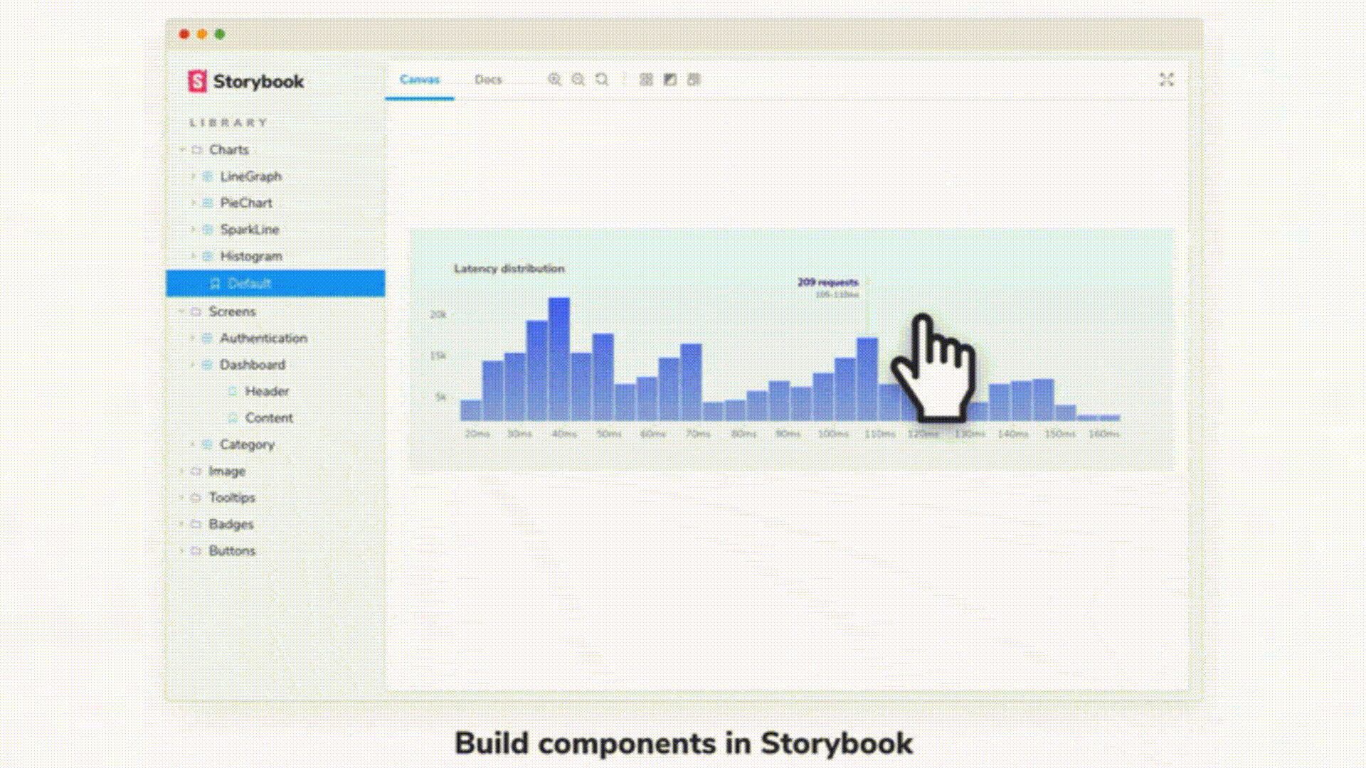
- Automatic documentation: By creating stories for your components, Storybook also serves as a form of automatic documentation. Each story represents a specific use case of the component and demonstrates its practical usage. Additionally, it features a dedicated documentation section that explains the various actions each component can perform.
Documentation example in Storybook [1]
- Facilitates collaboration: Designers and other team members can view and test components without diving into the code or setting up the entire project. This enhances communication and collaboration among different teams.
- Visual problem detection: By viewing components in different states and sizes, design or style issues are more likely to become apparent. This helps maintain a consistent appearance throughout the application.
- Compatible with multiple frameworks: It’s compatible with a variety of popular frameworks and libraries like React, Vue, Angular, and more. This means you can leverage its benefits regardless of the technology you’re using.
But can we bridge the design process with the development process?
The answer is yes! And thanks to Storybook, this can be achieved readily, as it creates a visual and functional bridge between designers and developers. Here’s how the connection is facilitated:
- Shared designs and components: Designers can view visual representations of interface components in different states and use cases.
- Visual and behavioral alignment: Designers and developers can work together to ensure that components align precisely with design specifications. By observing components in various states and sizes, discrepancies are easier to detect, ensuring visual appearance and behavior consistency across all situations.
- Iterative and collaborative feedback: Designers can swiftly create component variations for developers to implement, and conversely, developers can propose enhancements and adjustments that designers can directly view and approve within Storybook.
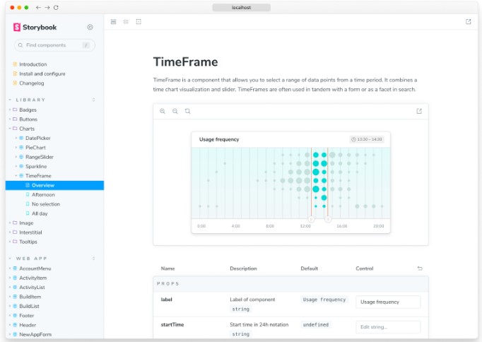
- Connecting Storybook and Figma: The design add-on for Storybook allows you to embed Figma files alongside your code-based components in Storybook. Simultaneously, the Storybook plug-in for Figma enables you to embed stories alongside your design components in Figma.
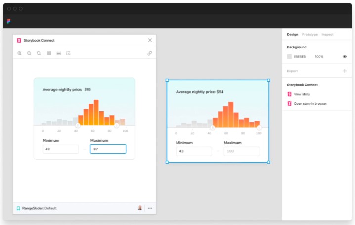
Storybook plugin in Figma [1]
Figma plugin in Storybook [1]
How to get the most out of Storybook:
In my opinion, it’s by using add-ons. Add-ons are extensions that expand and enhance the functionality of the tool. These extensions allow you to add additional features to your stories and enhance the overall experience when working with Storybook. Add-ons can provide functionalities such as visual testing, accessibility checking, internationalization, styling, among others. Some of these include:
- @storybook/addon-a11y: Helps verify the accessibility of your components by detecting potential accessibility issues and providing recommendations to address them.
- @storybook/addon-viewport: Allows you to test your components in different screen sizes and devices, simulating various viewports.
- @storybook/addon-docs: Generates automatic documentation based on JSDoc annotations in your component’s code.
- @storybook/addon-essentials: A set of essential add-ons that includes actions, links, background settings, viewport settings, and screenshot capture. This simplifies the installation and initial configuration of common add-ons.
It’s also essential to keep Storybook updated and follow agreed-upon style rules and best practices. This ensures that as the project progresses and new components are added, consistency in development is maintained, and long-term issues are avoided.
In summary, Storybook is a powerful tool that can transform your component development process. By enabling you to create, test, and visualize your components in isolation, it streamlines development, improves collaboration, and ensures the quality of the final product.
This is why Storybook has proven to be an invaluable tool, effectively addressing various challenges. Firstly, it has significantly enhanced isolated development and early testing by allowing developers to independently test components before integrating them into the main application. This not only streamlines error identification, but also optimizes the development process by avoiding premature integration of problematic components.
Additionally, it has facilitated collaboration between designers and developers by providing a clear visual interface for components, enabling a smoother understanding and easier isolated work testing. Furthermore, the tool has been instrumental in the quick identification and correction of visual issues, as the isolated visualization of each component simplifies the detection of potential problems. This is crucial because identifying visual problems in the main application can be challenging when many elements are interacting. Overall, Storybook has significantly strengthened our workflow and improved the quality and efficiency of development on multiple fronts.
References
- Storybook: Frontend workshop for UI development. (n.d.). https://storybook.js.org
Want to learn more? Let’s talk.

Snowflake Summit 2025 Announcements
Snowflake Summit 2025’s latest announcements made it clear: the path to genuine AI-driven impact hinges on frictionless access to data, the ability to act on it with clarity, and absolute confidence in its protection. Learn more about how they're making that happen for customers in this article.

How ChatPRD Helps Build Better Stories (and a Stronger Team)
When user stories are vague, it slows down delivery, trust, and momentum. This article by Senior Product Strategy Consultant Traci Metzger shows how she used a lightweight, AI-guided system (ChatPRD) to write clearer, developer-ready requirements that actually accelerated execution.

QA in the Age of AI: The Rise of AI-Powered Quality Intelligence
As organizations push code to production faster, respond rapidly to new customer needs and build adaptive systems, the expectations on quality have changed. It's no longer enough to simply catch bugs at the end of the cycle. We’re entering an era where quality engineering must evolve into quality intelligence and organizations adopting quality intelligence practices are reporting measurable gains across key delivery metrics. Learn more in this article by Principal Engineer Jarius Hayes.

Operational Efficiency in the AI Era: What Matters and What Works
Ever wonder how leading teams are cutting costs without cutting corners? Hint: it starts with AI. In this article by Principal Delivery Manager Kabir Chugh, learn how AI is powering smarter ops, faster deployments, and measurable savings across industries.